Meet Rachael, a super talented copywriter based in Germany. Having had her toe in the self-employed pool for a little while, she decided that it was time to take the plunge.
She needed a visual identity to match her calibre of work. This needed to allow her to walk into meetings and conferences with confidence – no matter which language was being spoken. We had to make sure that what Penned By Rachael has to offer could be communicated clearly and easily.
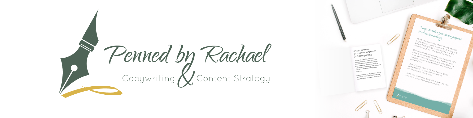
Rachael uses a fountain pen and was keen to have this represented prominently in her imagery, so we created a simple logo which sat the fountain pen icon alongside the calligraphic lettering. We added a touch of detail where the ‘y’ of ‘by’ hooks seamlessly into the ampersand below.
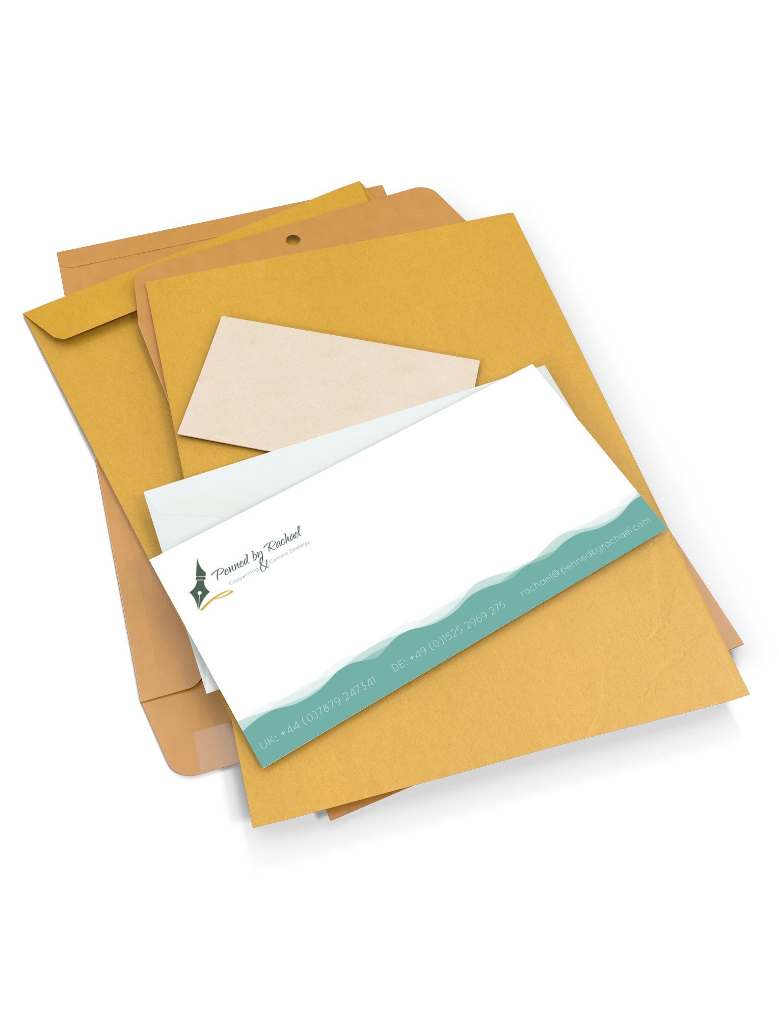
Once the logo aesthetic was agreed, we provided Rachael with business cards, and templates for a variety of documents including letter heads, compliment slips, a handful of presentation slides and invoices.
We also provided her with a very comprehensive style guide ensuring all aspects of her communication will be consistent and on brand.