
Impactful UI
As a UI enthusiast, recognised within my teams as the UI Expert – I know the impact a strong look and feel can have on your users’ trust and engagement with you.
Just as a brand design comes with a use guide, we need to create the same for your digital presence. Typography, colours, imagery, interaction states, these all need to be defined for your digital touch points. Don’t expect what works in print to work in the responsive digital landscape.
Take a read of my article outlining the steps of the UI process.
Below are a few examples of projects from my career.

Psychometrics Consultancy Marketing Website


Client
Seeing Theta
My Role
Design, WordPress Build and Client Management
Piper, the person behind the brand Seeing Theta is vibrant, bold, energetic, thoughtful, intelligent. While she works in the medical industry where brads are often sterile and serious, we wanted to create a brand and web presence which reflected the experience clients had when they worked with her. We landed in this space where we balanced her vibrant personality with the seriousness of the topics worked on by injecting flourishes of colour through images and graphical elements across the site. To enhance and excite, not distract.
The tone of site copy and articles also reflected this balance. Complex topics explained clearly and simply, without detracting from the data insights.
Florist Marketing Site


Client
Tina & Co Floral Design
My Role
Design, Wix Build and Client Management
Tina has beautiful imagry and we immediately knew that these needed to be at the fore front of the site, strong and bold showcasing to the visitors what works of art could enter their lives.
Tina had used scripted fonts elsewhere. We were able to use this for headers but we needed to introduce a simple companion font for body and smaller copy, both introducing ledgibility and onec again allowing the images to do the talking.
Analytics Tool for Soccer Data Analytics

Client
StatsBomb
My Role
Design System Designer and UI Specialist
This product utalised Kitbag, a Design System I created which is based on ‘Blue Theme’ the design language I defined.
StatsBomb IQ for Soccer was our flagship product, it was build slowly overtime and contained innovative, detailed and trusted data visualisations and data tables. It had however been built in a language which was not common, and had a lot of limitations. The decision was made to rebuild the tool and bake in customisation, saving, translation and other heavily requested features from the start.
We also took this as an opportunity to revisit the style and enhance the design language to impeove accessibility and ledgibility. See this case study to look more deeply in these UI decisions.
Originally this product had a very muddled style, it is very content heavy, but our users and the testing results told us that all the information was essential. To allow the data to stand out, we toned down the UI, kept all background elements within a colour gradient to communicate depth, we used tiles to group elements and subtle strokes to divide grouped content up further.
The zingy interaction blue was used to draw users attention to the actions to take them to the next step on the flow, on this screen that is selecting filter sets and loading them.
Analytics Tool for American Football Data Analytics

Client
StatsBomb
My Role
Design System Designer and UI Specialist
As with the Soccer tool above, this product utalised Kitbag, a Design System I created which is based on ‘Blue Theme’ the design language I defined, this time, the default mode is dark. Originally this product had a muddled style, it is very content heavy, but our users and the testing results told us that all the information was essential. To allow the data to stand out, we toned down the UI, kept all background elements within a colour gradient to communicate depth, we used tiles to group elements and subtle strokes to divide grouped content up further.
The zingy UI blue was used to draw users attention to the actions to take them to the next step on the flow, on this screen that is filtering and ultimately downloading the graphic for their reports.
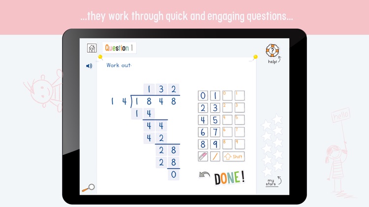
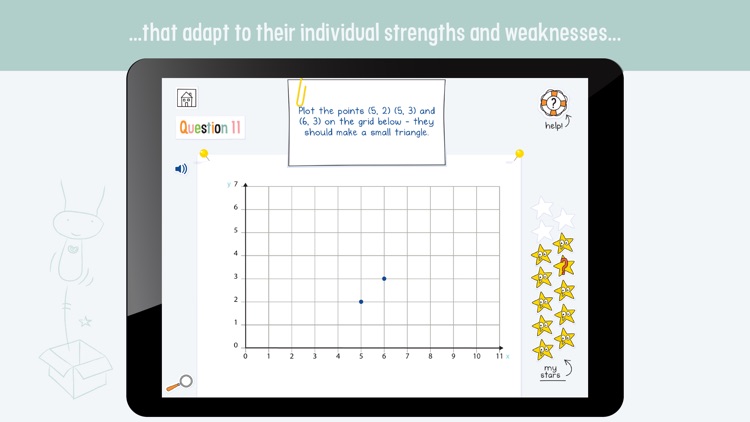
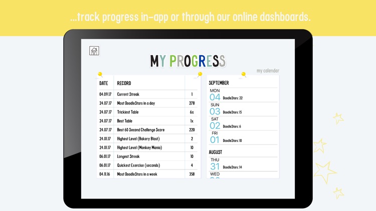
Maths Tutorage for Children aged 3-14

Client
EZ Education
My Role
Digital Designer
DoodleMaths is an app to encourage children to practice their maths, for 10 minutes a day, and have fun while they learn.
Taking the artwork from a childrens book illustrator, I translated these into digital files and ensured the developers had all the assets required to build each screen. There was a lot of customisation ensuring the files were small and would adapt to any content, while being fun, bright and energetic for the little users.
Changes we made included:
- lightening the background blue, toning this down allowed the content to brighten.
- Following observations, just adding the padlocks did not communicate to little hands that those sections were closed, we had to visually dim the buttons.
- Animating the Congratulations screen, including animating the stars dropping into the counter. This added noticable joy to the small users.