Mike was coming up to a big release and was not satisfied with his existing logo. It was clever, but didn’t set the product apart from other tech companies.
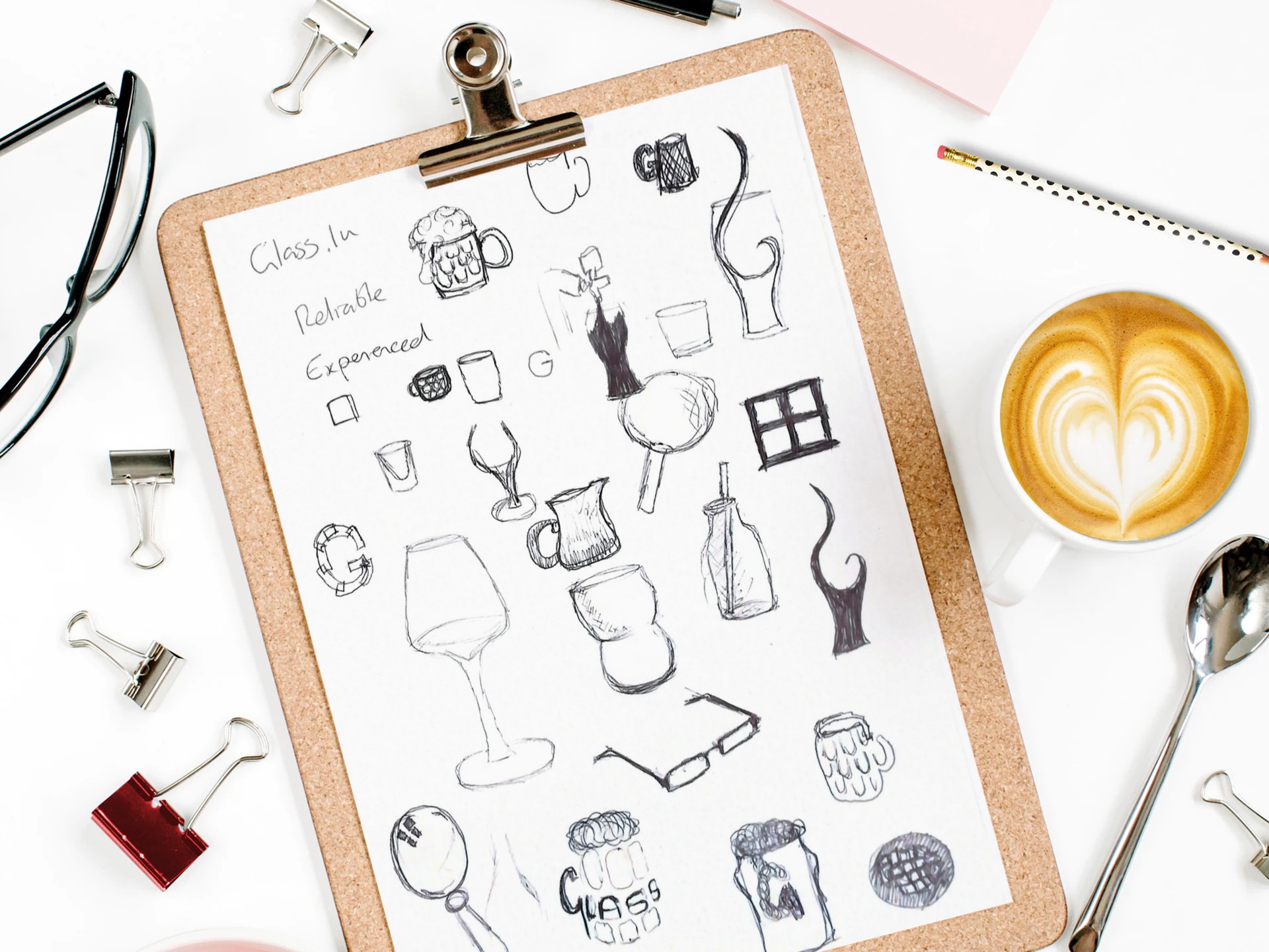
We explored a handful of directions to take the brand from simple lettering to abstract shapes or representations of glass interacting with nature, then settling on a return to the brand’s original roots: a simple pint glass.

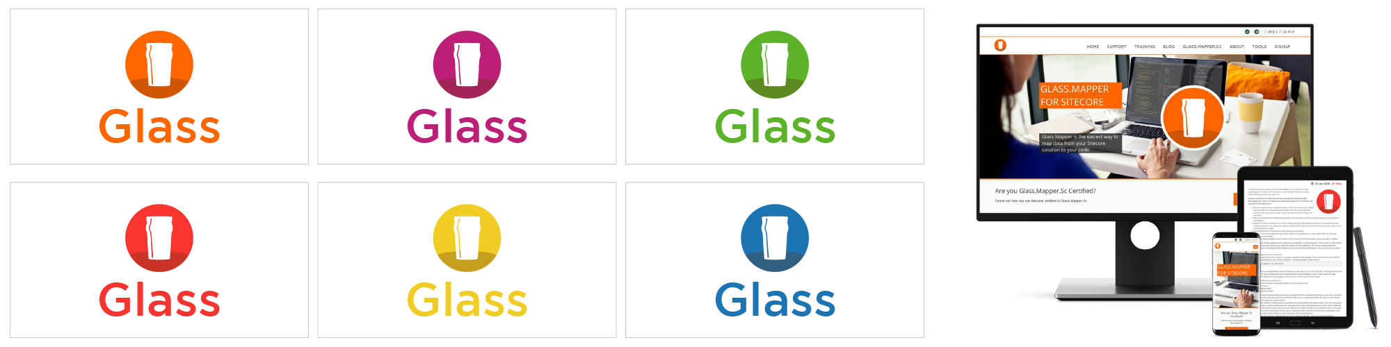
We also provided Mike with a style guide ensuring all aspects of their communication will be consistent and on brand as they scale.
A few months later, we created this handy ‘cheers’ for sharing thanks to new Patreon pledgers.
We did a couple of variations of the cheers before settling on this. Mike also has the choice of all six colours!


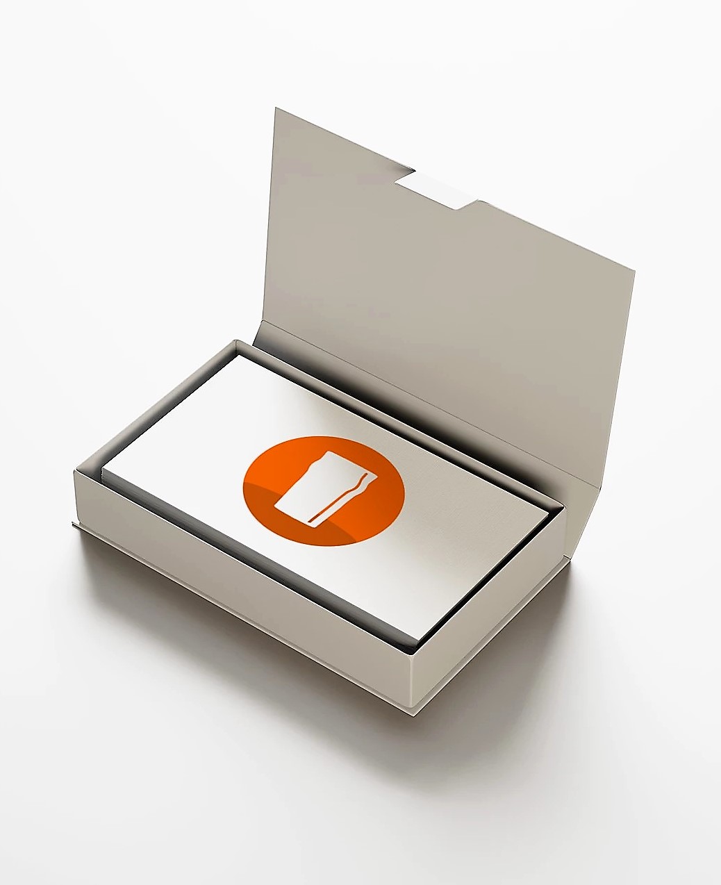
The logo is awesome and works well as both a logo and an icon which is instantly recognisable and flexible.