We met Mike earlier this year when we created a brand for glass.mapper so were delighted to work with him again.
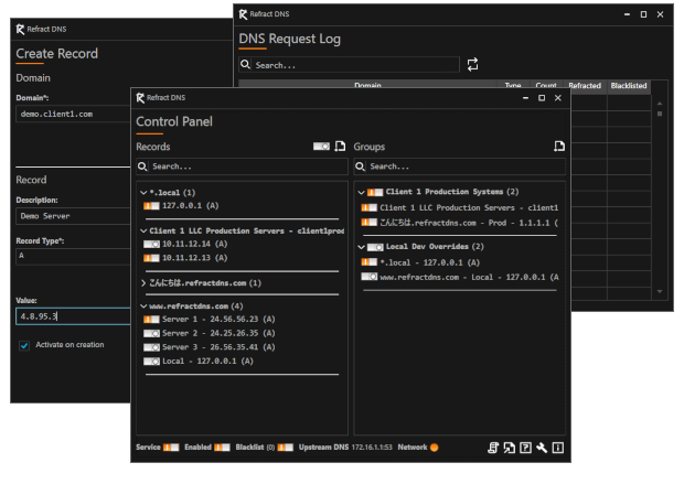
This time, Mike was creating a brand new product, a smart tool for Windows based Developers looking for an easier way to temporally alter the local DNS records. The solution is clean and fuss-free so required an equally clean and fuss free aesthetic.
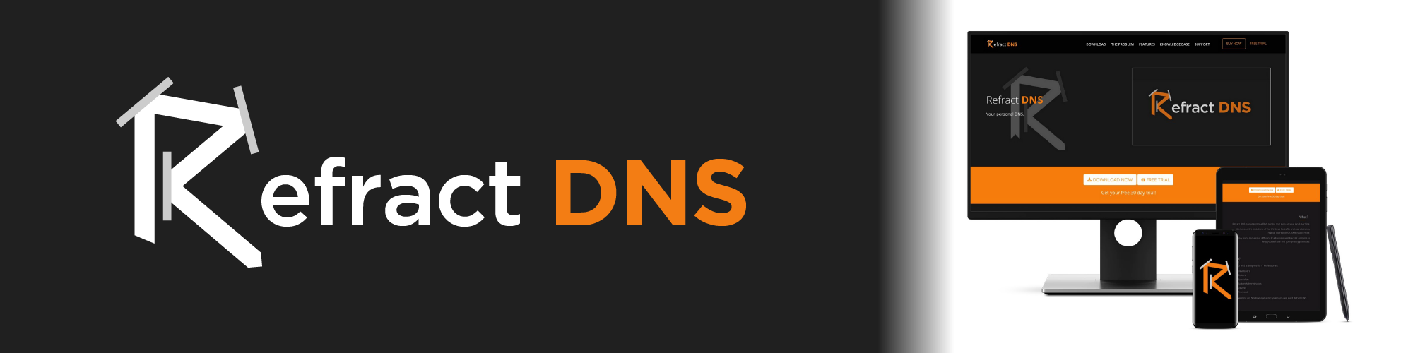
The final logo was the letter ‘R’ created from a beam of light reflecting off a handful of mirrors strategically placed mirrors. With that as the logo, of course the animation had to be the beam reflecting around the mirrors.
Again, the brand is just what I needed.
Following the initial chat, Kat created a handful of initial ideas and we developed the two favourite’s into the final version. I like the smart little animation for the beginning of my how-to videos.