
(2 minute read)
One of our recent projects has been a slight departure from the usual: while we don’t usually design wedding stationery, when the opportunity for a skills trade-off comes up, it’s hard to say no!
 With an upcoming wedding, Emma and Tom wanted an appropriate graphic design which could be used for save the dates, invites, menus, place cards and all the other paraphernalia which comes with a big event. We met to discuss imagery and created some graphics which would be suitable. We also looked at fonts and colours, as well as general styles to get a feel for what would work. Once we had something we were happy with, it was sent to a local printers for a quote and then I met with Emma to discuss it.
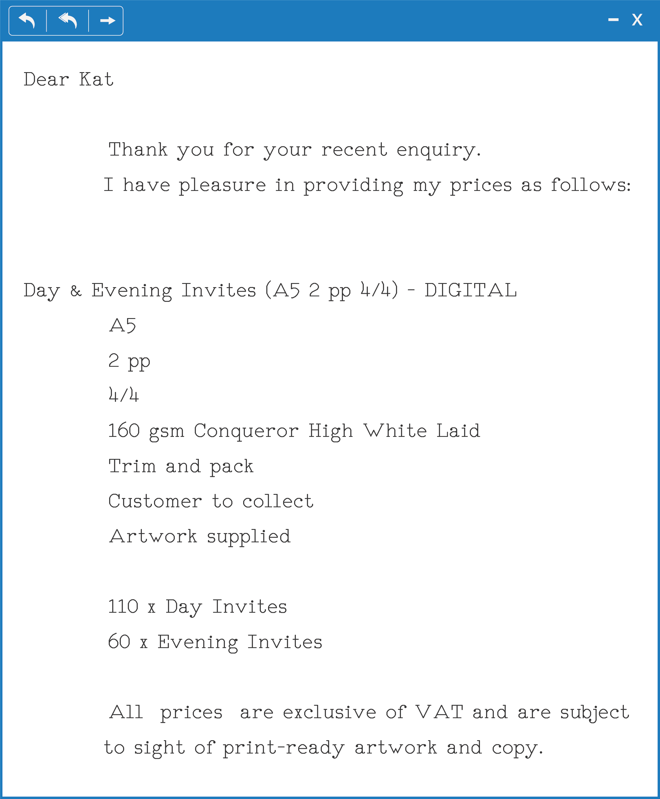
Studying the email, Emma confessed that she had absolutely no idea what the content actually meant: the terminology used by printers and those in the business is very specific. Knowing this, we set aside some time to go through the quote and look at what that meant specifically in the context of the invitations.
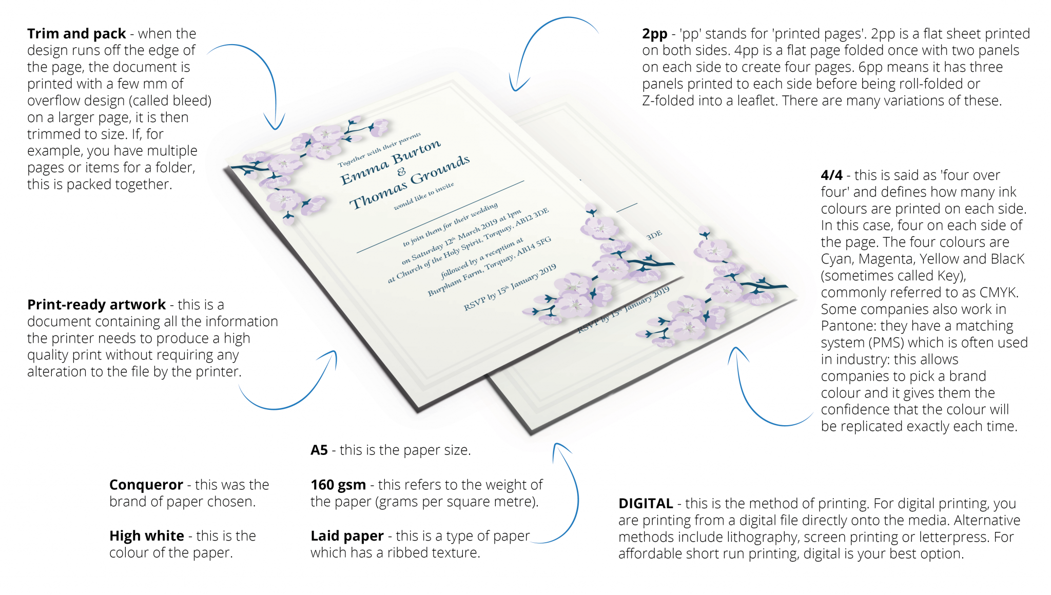
We know that using industry-specific jargon can be quite confusing. As clients approach companies for a range of purposes, it is imperative that everything is made as transparent as possible. When working with a business, they should ensure that you understand all the necessary options and, if there is something you are not sure of, they should make the time to clarify it for you. As Emma said, “Working with Kat has been incredibly easy. From start to finish, she has made time for me and has checked that I’ve been happy with the process. It really has been consultative all the way through and I absolutely love the finished product. I wouldn’t hesitate to work with Gradino again and I’ll be recommending Kat to everyone I know!“